We seem to refer to Toronto a lot in statistics. But it can mean different things to different people at……different times.
Imagine leaving Toronto City Hall in 1961. You would be leaving Old City Hall; the building we know today would not open until 1965. Head west toward Hamilton and you could take the QEW and cross the Burlington Skyway, then only three years old. But the names along the road would be different. After leaving Toronto and passing through Etobicoke, you would enter Toronto Township—the future Mississauga. Near the QEW at Dixie Road, Applewood Acres already had 850 suburban homes. Toronto Township, Port Credit and Streetsville together had just 74,875 residents in 1961. They joined to form Mississauga in 1974.
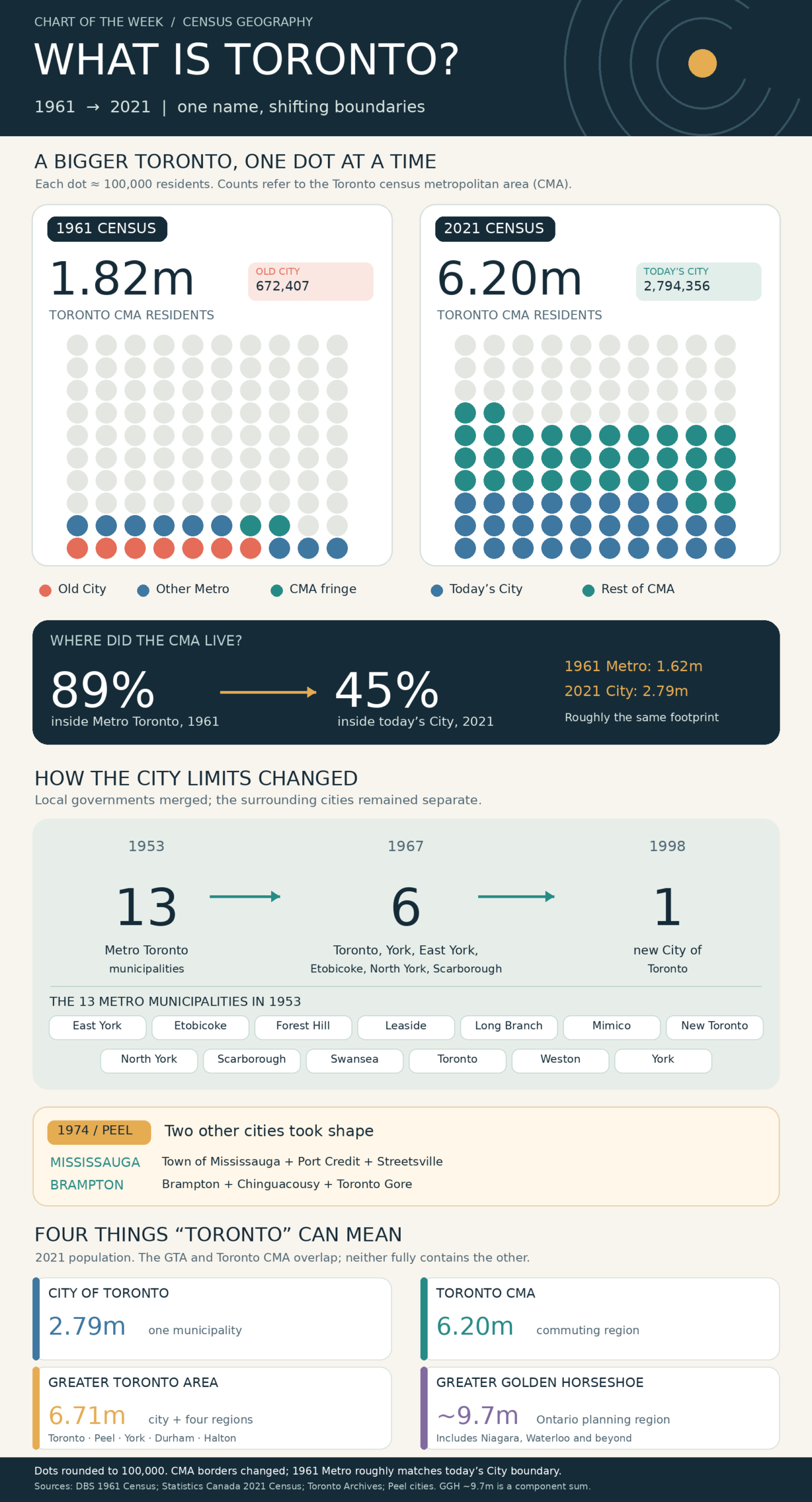
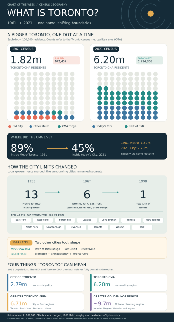
Or drive along Sheppard Avenue or north on Highway 400. Both roads existed. Near Sheppard and the 400, new subdivisions and industrial buildings stood alongside open land. This was North York, then a municipality in its own right. Nearby Jane Heights and Black Creek grew from 1,301 residents in 1961 to 33,030 in 1971. Our infographic captures the change at a larger scale: in 1961, 89% of Toronto CMA residents lived within Metro Toronto. By 2021, 45% lived within today’s City. The CMA’s boundary changed over that period as well.
The boundaries still surprise us. Drive through Burlington today and you are in the GTA, but Statistics Canada places you in the Hamilton CMA. That is why a Toronto unemployment rate, a City poverty figure and a profile of the region’s leading industries may describe different places. Before comparing them, we need to know who drew the map.
Toronto, it seems, is in the eye of the boundary-holder.